
Branding Guide
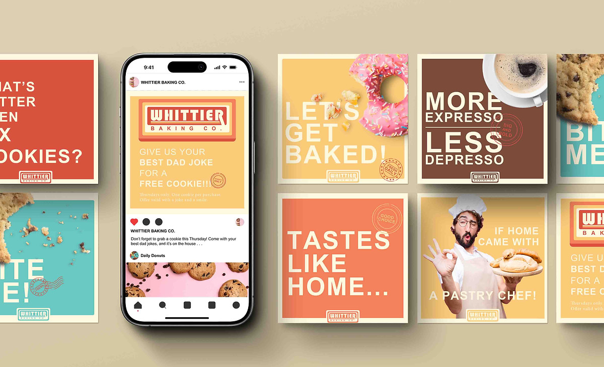
Tastes like home — if home came with a pastry chef.
Our bakery is rooted in community, creating a spirited space where people of all ages can gather, while every cup and bite offers the comforting warmth and uplifting energy that brightens daily life.
Brand swatch
Project Overview
This project brings Whittier Baking Company’s vision to life with a brand identity that blends fun and a warm, welcoming vibe. Based in sunny California, the company needed a look that feels as inviting as its baked goods. I created a comprehensive branding guide, custom logo, polished invoice, enticing menu, stylish swag, and research-based personas to ensure the brand resonates with both college students and retired locals.
All visuals use Adobe Stock photography to round out the story.
Client
Whittier Baking Co.
Disciplines
Branding
Typography
Pattern Design
Packaging
Fun Illustrations to show off Style - Maybe some motion

COLOR VARIATION LOGO W/ BRAND MARK
BRAND MARK
SUBMARK
Cocoa Crust
#794A3A
Cherry Glaze
#DC5341
Apricot Jam
#F57F5B


Honey Butter
#FACA78
Mint Whisk
#68C7C1


Fun Illustrations to show off Style - Maybe some motion
Paper Sketches
Logo Vector Icons
Logo Reveal
PATTERN
Digital Motion Menu
Loyalty Card


Poster
Poster
Packaging - Take Out Bag
Packaging - Coffee Bag
Swag
The Background work
Research Personas
Every great project starts with research. I engaged with people from the area and explored various shops in Whittier to gain insight into the local culture. To maintain privacy, I focused on gathering concrete information through online research or through observation. The personas I developed are a reflection of these findings, combining insights from both firsthand experiences and digital sources.


